Most pro-dommes invest a bunch of time in brand management and marketing. It’s no good being a wizards with whips or looking lovely in leather if nobody know that. To that end they build websites, curate their social media, film clips, write articles, model fetishwear and generally put their dominant diva selves out there.
I thought I’d seen most ideas for domme brand building over the years – until I stumbled on this article on a domme’s bespoke typeface. London’s Jane Grey worked with WMH&I to create a custom typeface for her brand.
The brand’s distinctive asset is “binds”, strips of their bespoke typeface distorted to appear like ropes or leather, adding a subtly erotic edge to the campaign without nudity. The ability to suggest and entice is key in WMH&I’s arsenal of text based playfulness. “The ‘binds’ are a visual representation of Jane Grey’s psychological control,” says Mark. “Always taut, the binds emanate directly from Jane when present in the scene or act as her omnipresent control when she’s just off camera.” Aiming to disarm an audience of willing “subs”, this text-based experimentation dabbles in the dark arts of mind tricks and manipulation.
You can see the typeface in action via Jane’s website. I’m not sure how much it’ll help attractive submissives, but it is interesting to see the effort that can go into brand building.
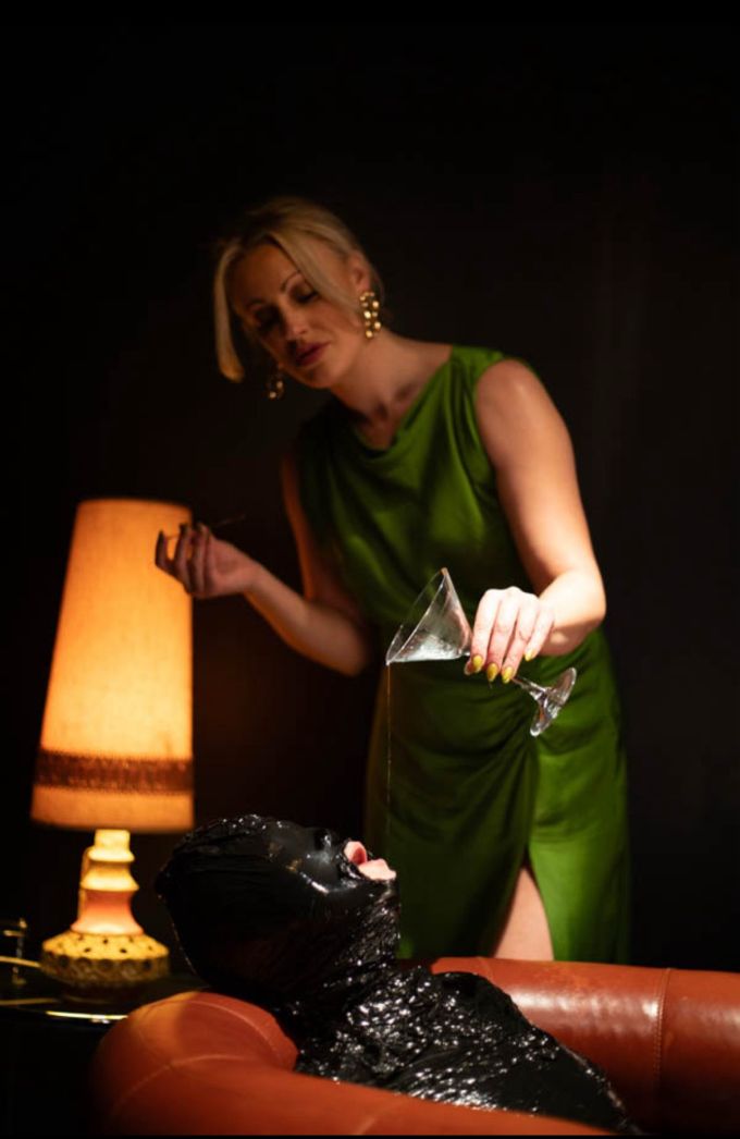 This beautiful shot was sourced from one of Jane’s social media feeds.
I’ve often wondered if all that time invested makes sense from a monetary perspective and I honestly doubt it. Assuming a domme runs a one person business, they have only so many hours in a day available for sessions.
Don’t often talk with pro-dommes about this stuff but most of them certainly don’t do sessions for eight hours a day, five days a week. I’ve heard some saying each session costs a lot of energy, especially the good one. And after several months of sessions, they have to replenish their creative energy [her words, not mine].
Despite that, some dommes no doubt believe continue building their brand works for them. To some extent is no doubt does. For others it’s vanity and some just enjoy it. Compare the ‘international’ globe-trotting domme to dommes who don’t enjoy travelling halfway round the world to meet their slaves. Quite a few professional dommes who prefer to lurk in the shadows. Try and book a session with them and see how long you have to wait. To each his own I guess.
I think in this case it’s clearly a thing the domme is passionate about rather than a simple $ calculation. Nobody is booking a domme based on a typeface, no matter how nice it is 🙂
However, for most dommes doing more traditional brand building and advertising online, I think that’s pretty essentially. Particularly in the first half of a career when building a reputation and presence. Just look at all the complaints and issues when social media sites / advertising sites / search engines / etc. suppress or ban sex workers. A lot of pro-dommes will share stories of the significant impact that can have on their earnings.
-paltego